‘NO BULLSHIT’ LABELING
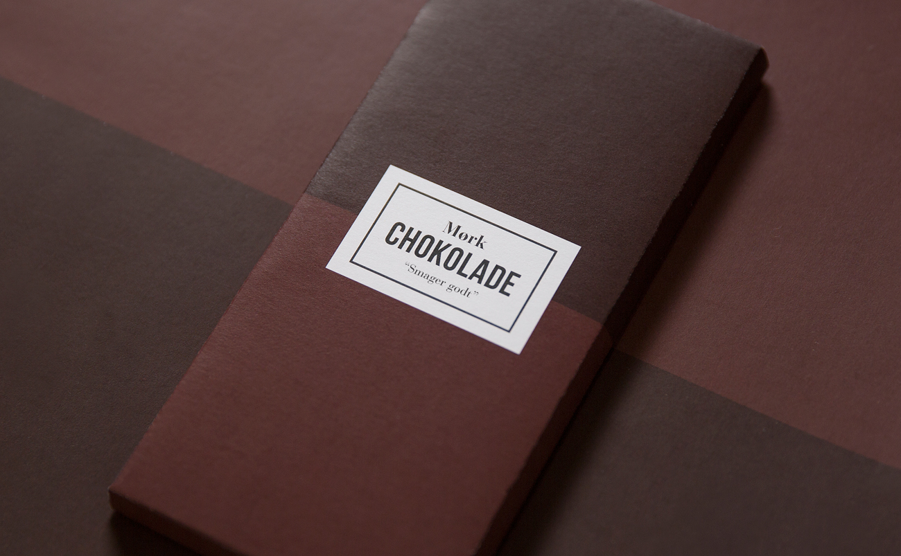
BRIEF:
_
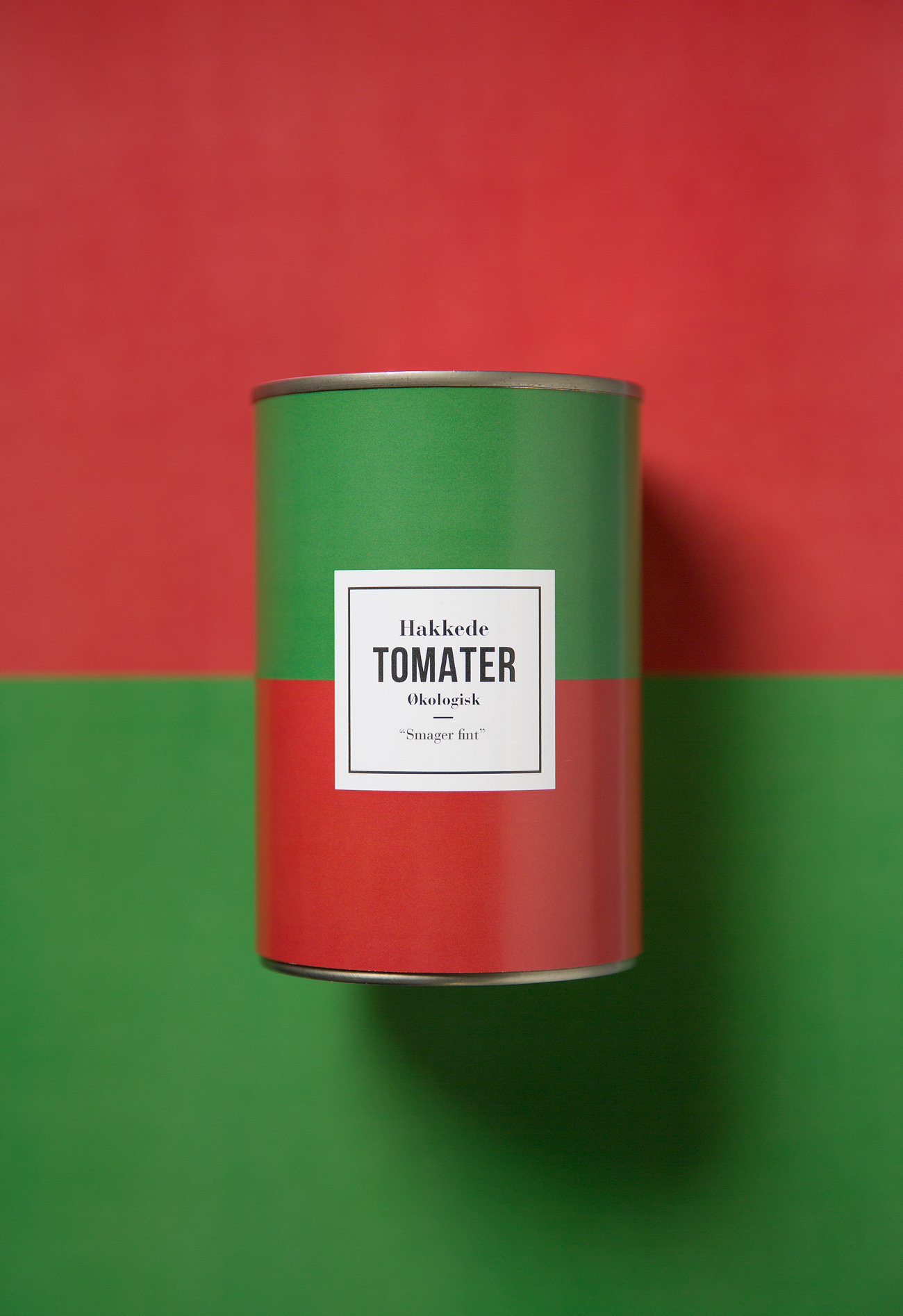
Almost every single product in a supermarked want to tell us just how fantastic their product is and tastes. They overload us with tastefully descriptions that appeal to our senses – even in a fairly homogen product such as canned tomatos. This agressive labeling prevents us from forming our own unspoiled oppinion.
But what if there were a such a thing as a 'Transparent Label' that would give us the opportunity to form our own opinion, by not overselling the product and actually just informing the consumer what is really is, by taking a much more modest and truly hornest approach to branding?
But what if there were a such a thing as a 'Transparent Label' that would give us the opportunity to form our own opinion, by not overselling the product and actually just informing the consumer what is really is, by taking a much more modest and truly hornest approach to branding?
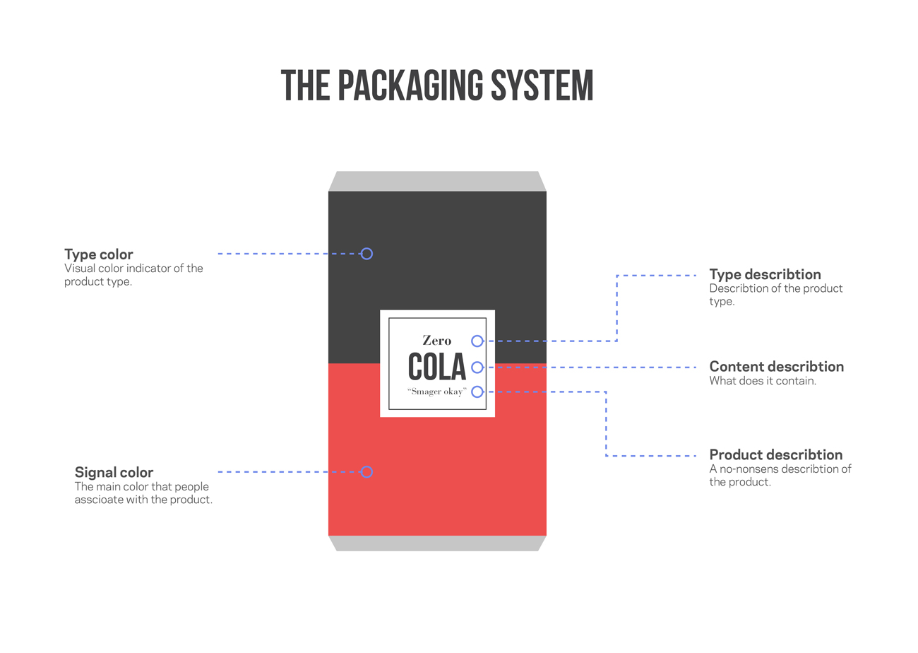
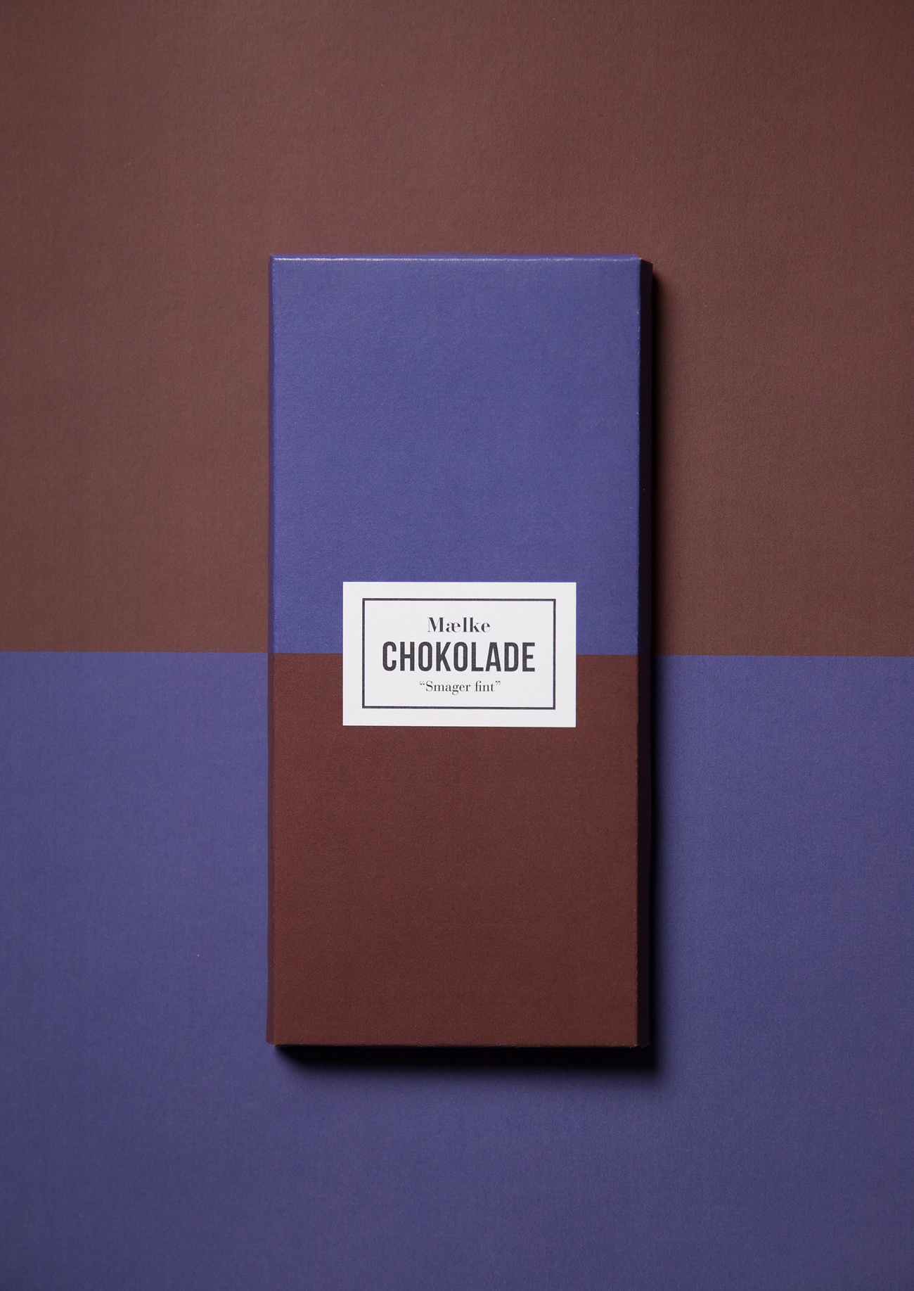
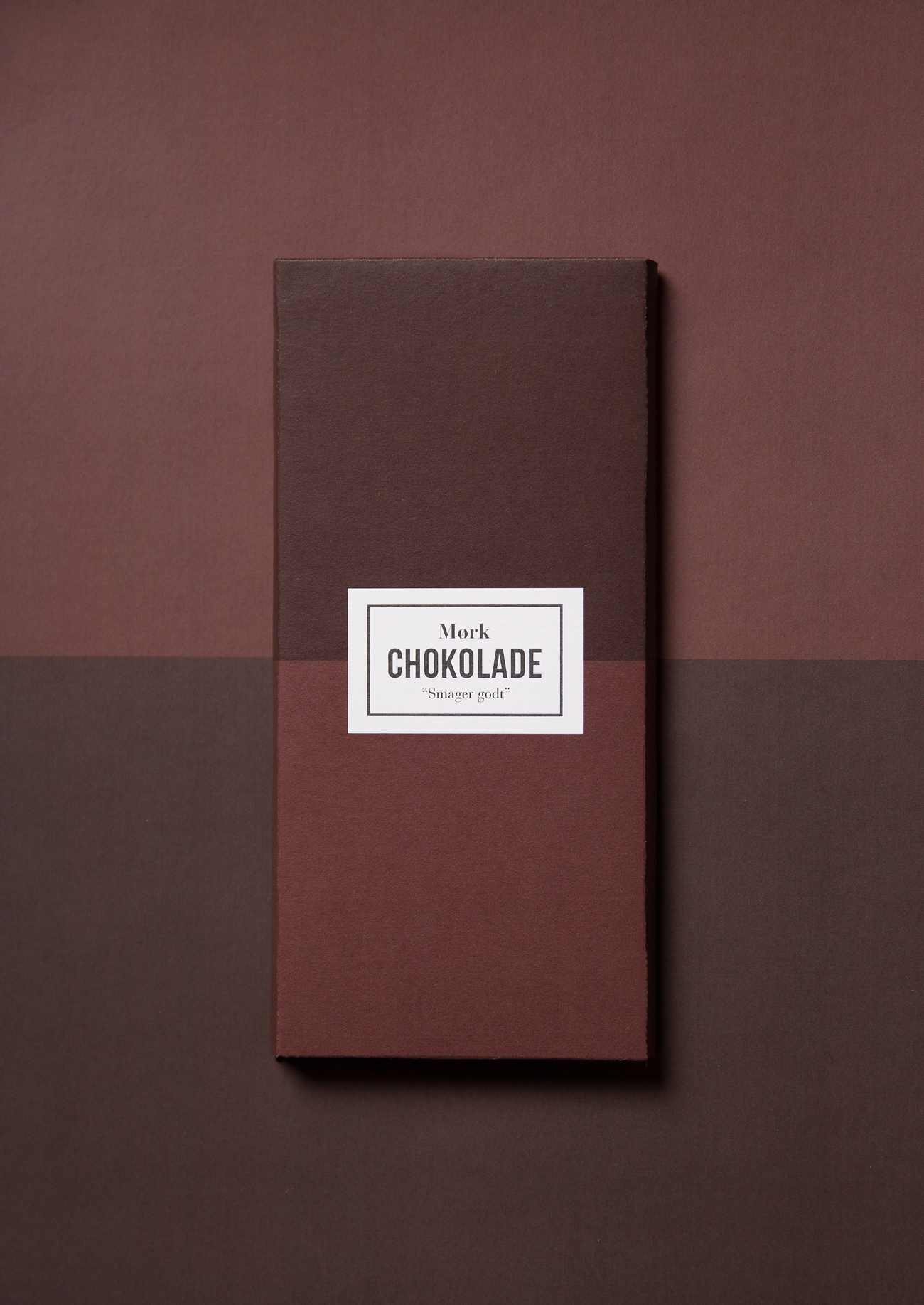
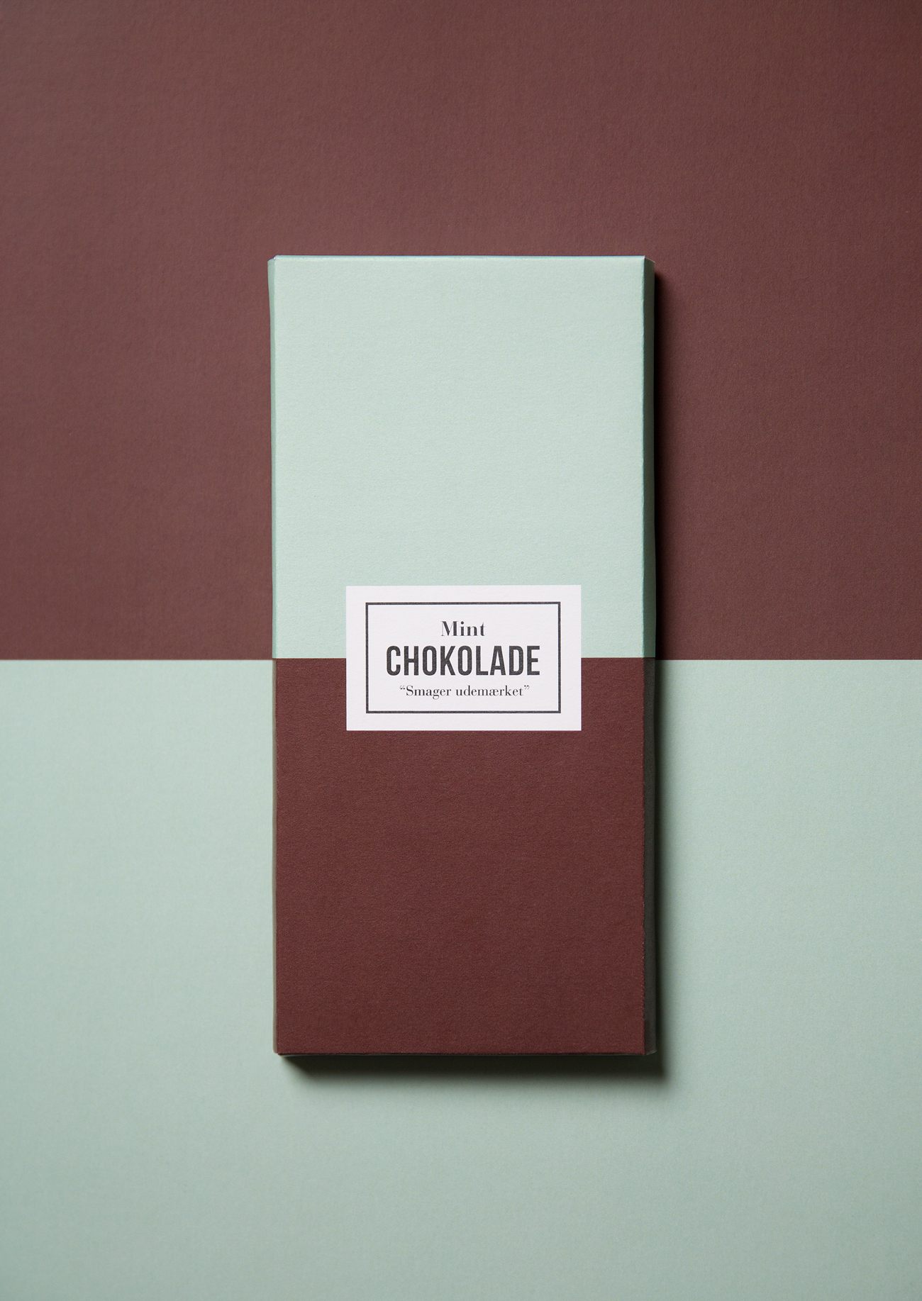
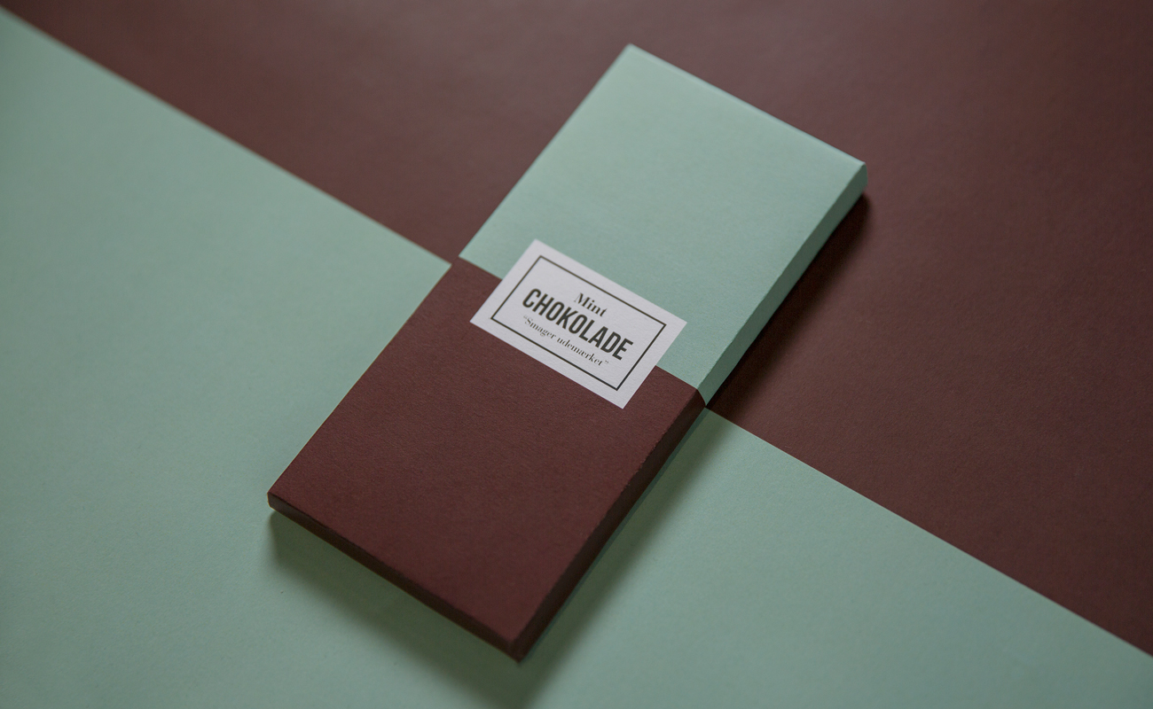
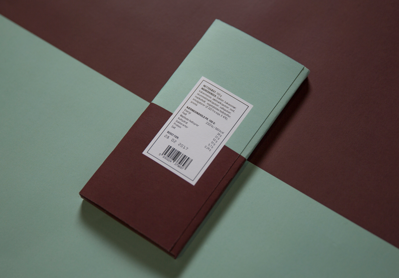
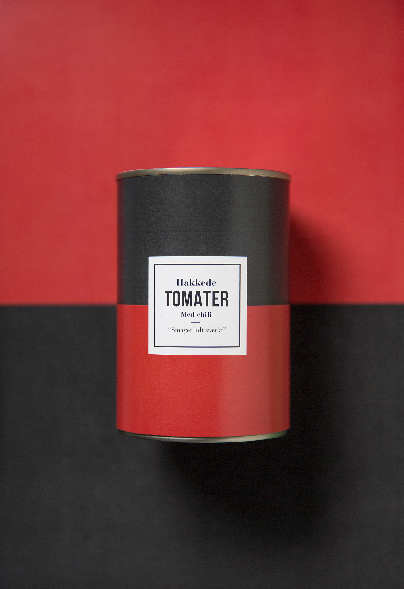
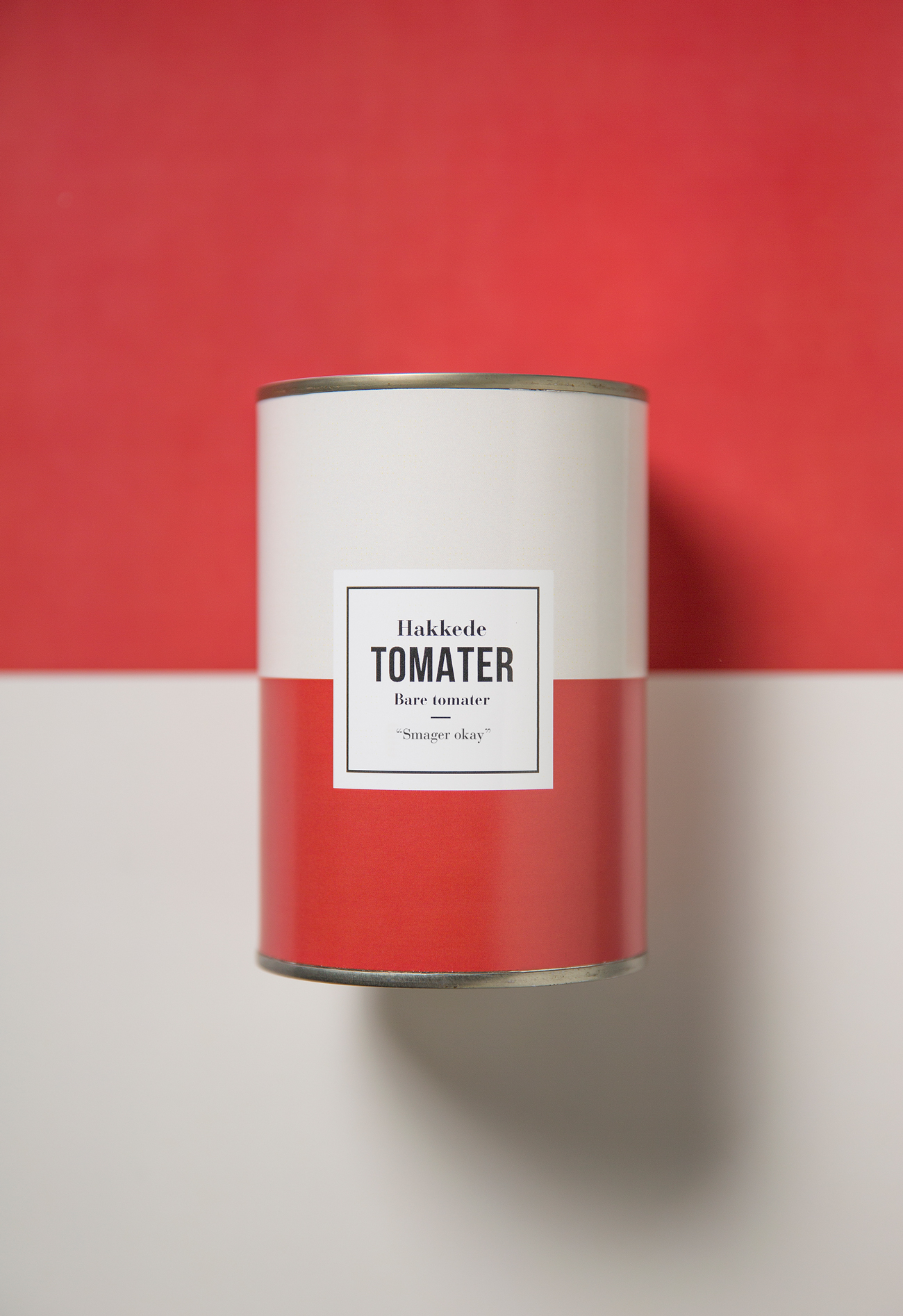
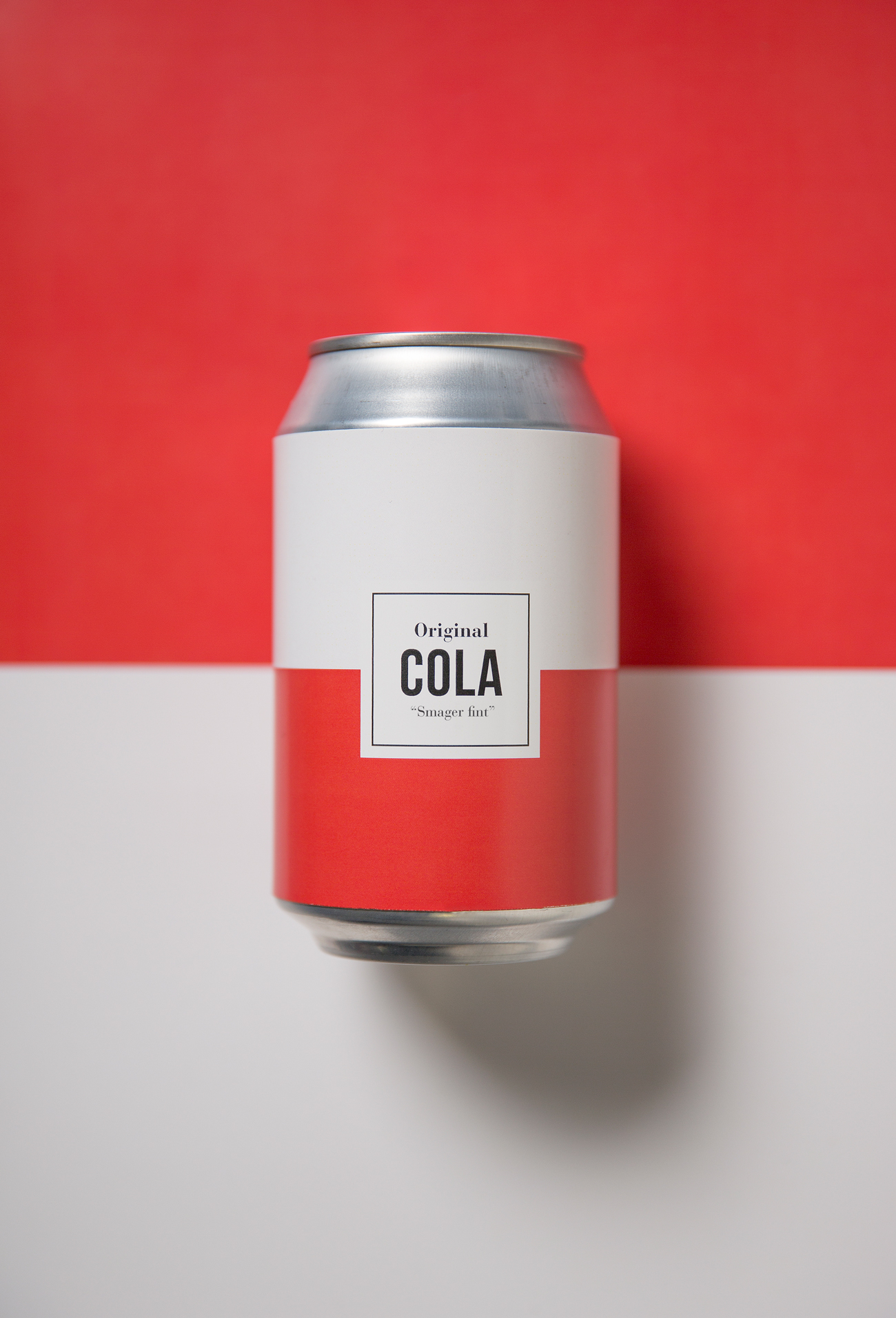
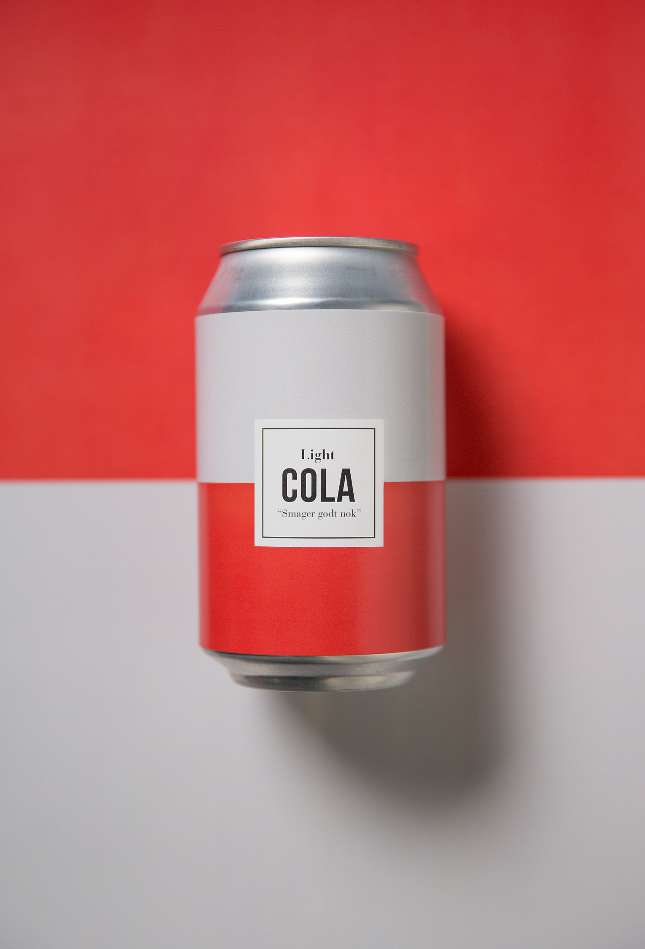
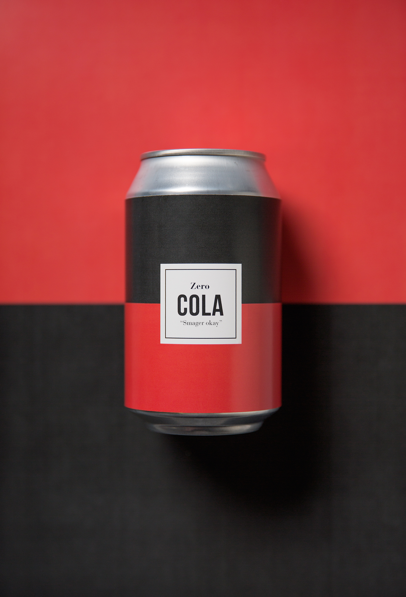
We decided to investigate this area and to come up with a solution for a product line where all text and graphics were cut down to its bare minimum, yet still making it a sellable product. By playing with signalcolors for three different product categories we created the system: No bullshit branding.
Concept & Design: Jane Kloster & Jacob Ljørring

